


Unless your flying is limited to local sightseeing in good weather, chances are you’ve used winds aloft charts at some point. For many commercial and military pilots, they’re a staple of the preflight weather briefing, and they’re easily found on sites like aviationweather.gov. These charts are constructed by weather centers at a series of designated heights, such as 12, 18, 24, and 30,000 feet.
These charts obviously have utilitarian value in helping you plan fuel burn, visualize tailwinds and headwinds, and give you some idea of how you can adjust your route. However, these charts also paint a detailed picture of what the weather is doing. As an aviation forecaster, I’ll give you an idea of what mental picture we see when we look these charts over and show you what kinds of hazards and trouble spots they might illustrate.
Understanding
To put the winds aloft in their proper context, it’s important to have an understanding of how the atmosphere works. We’ve covered some of the nuts and bolts already in prior articles such as “Weather Deconstructed”, which explains at length how the global circulation develops in response to surface heating and how the upper-level patterns organize. In this installment we’ll explain the weather systems themselves.
The single most dominant feature we see on upper-level charts is the vast amount of high pressure in the tropics. Look at any winds aloft chart, like the sample above, and we can see that there is a strong tendency for the westerly upper level winds in the tropics to rotate clockwise. If you put a large propeller along the bottom margin of the chart and let the winds rotate it, it would be pushed in opposing directions in some areas, but the vast majority of the time this propeller spins clockwise.
This paints out anticyclonic circulation. In the Northern Hemisphere, clockwise rotation always implies the existence of high pressure, whether at the surface, the troposphere, or the stratosphere. Likewise, cyclonic circulation has a counterclockwise spin in the Northern Hemisphere.
The only exception to these rules occurs when rotation is unusually fast over small scales of space or time, making the Coriolis contribution negligible. This would include circulations such as tornadoes (which get their spin from larger scale interactions), as well as mountain breezes, dust devils, and even the spin in a toilet bowl. But on large scale weather maps, the anticyclonic and cyclonic rules of thumb hold true.
So the clockwise tendency in the tropics identifies areas of high pressure. Standard meteorological analysis charts, which evaluate geopotential height with respect to pressure, also reflect these areas as having “high heights,” equivalent to high pressure.
This high pressure is caused by the great volume of the heated tropical air. Chances are you’ve opened a gasoline container on a hot day and noticed a release of pressure. This is due to the molecules of gasoline vapor becoming more active, building pressure in the head space and requiring more volume. It works exactly the same way in the atmosphere. The easiest escape valve for the tropics is expansion in an upward direction. Pressure levels (the level to which we would have to raise a barometer to find a specific value) rise, and we create high pressure aloft. This tendency for high pressure increases with respect to height.
The opposite effect takes place in the polar regions. The relatively inactive air molecules settle down closer to the ground, taking up less volume, and leave a void aloft. So we find an increasing tendency for low pressure with respect to height. This void doesn’t just cover the North Pole; its effects extend well into the temperate latitudes. This gives us a polar vortex, which is technically not the killer storm that made headlines in winter 2014, but for meteorologists is the giant, permanent area of low pressure found aloft in the polar regions. It’s always there, even as you read this page, and it spans thousands of miles.
Polar Fronts
With lots of solar heating in the tropical regions and plenty of cooling in the polar regions, air masses with widely differing temperatures are generated. The air mass in the polar regions is called just that, a polar air mass, while its southerly counterpart is referred to as a tropical air mass. A polar air mass will have temperatures ranging from well below zero up to around 70 degrees F, depending on the latitude and the season. Temperatures in a tropical air mass range anywhere above room temperature, but a very common temperature is 80–85 degrees F.
These air masses typically come together along a polar front. This is where the temperature discontinuity is most prominent. The front marks the meeting of the two air masses, where the warmest part of the polar air meets the tropical air. Because of this, we see a decrease in temperature on the cold side of the polar front, and co-changes on the warm side. This is a rule of thumb we use in weather analysis.
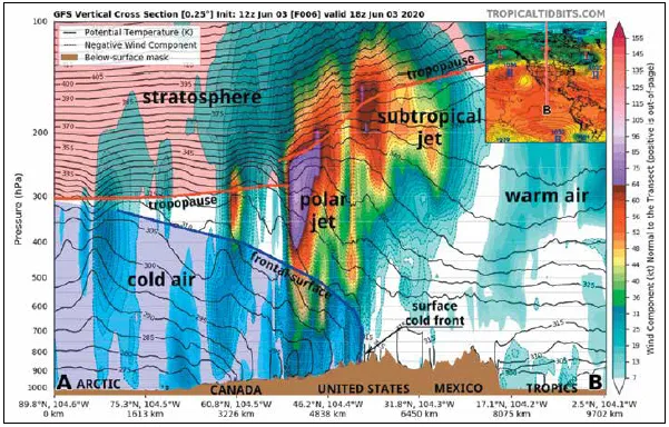
This temperature gradient along the polar front does not go unnoticed in the upper levels. As we just discussed, the pressure changes increase with height. This difference in pressures aloft leads to an increase in the horizontal pressure gradient above the front, which amplifies with height. Of course, the greater the pressure gradient, the greater the wind speed.
The result is an increase in wind speed with height. Above 10–15,000 feet and maxing out around 30,000 feet, the wind speed increases enough so we can identify a distinct jet stream. This is concentrated mostly over the gradient on the poleward, or cold side, of the polar front, and is caused by the low-level temperature gradient itself.
It’s that simple. We don’t need to go into math or extended physics explanations to explain why the jet stream is there. And the takeaway is where you see a jet stream on winds aloft products, you can assume a frontal gradient zone is beneath the jet, and the front itself will be found a little ways toward the equator, usually within about 100 to 300 NM of the jet. In fact, forecasters are actually pretty skilled at taking a single upper air chart and placing the expected locations of warm and cold fronts.
And another rule of thumb is that jet maxes, or cores of the strongest wind within the jet stream, correspond closely to deep surface low pressure systems. In the example chart at the top, we find the strongest winds are just to the right of center of the chart. By counting the 50-knot pennants, the 10-knot barbs, and 5 knot half-barbs, we can see the strongest winds are 115 knots.
From this we can assume that an intense surface low is located close to the center of this low, and probably has a cold front extending southwestward and a warm front extending east or southeastward.
Finally we can identify a few areas for clear air turbulence (CAT). These are mostly beneath the jet stream where winds increase most rapidly with height, and along the poleward edge of the jet. Occasionally over rough terrain or within unstable air masses, the jet max itself will contain strong turbulence. But away from the jet stream, the likelihood of CAT is much reduced. In weak upper-level flow, the main turbulence sources will be thermals if there’s strong heating, from mechanical turbulence if there’s strong surface winds, or convective turbulence if there are cumuliform towers.
Learn From the Patterns
Finally there’s the skill that comes from reading the upper level-charts. You can do this too, and we’ll point out some basics.
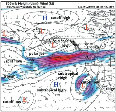
Just as we’ve said that high pressure aloft is correlated with warm air masses, the same thing goes for ridges. These are “bumps” extending from the tropics into the temperate latitudes where the wind appears to be displaced poleward, producing a curve where the wind has to change direction in a clockwise sense, or to the right (in the northern hemisphere) to flow around it. A couple of examples are given in the chart above.
These features are called ridges and they actually mark areas with lots of warm air throughout the depth of the troposphere. We can see one ridge at the right of the chart over New Mexico, and this tells us that conditions are warm there and that density altitudes there will be a bit higher than usual. Particularly strong ridges will become closed highs. Quite often during the summer, closed highs in unusual locations will highlight the location of heat waves.
There are also two special types we will cover. One is the subtropical ridge or subtropical high. These are basically fingers of the large tropical air mass to the south. The upper level high associated with the Bermuda High is a good example of a subtropical high. One other case we sometimes see is the cutoff high, which is a closed high located poleward of the polar jet. These too will correspond to warm weather.
The vast majority of the time you can expect VMC in these ridges and highs. But they’re also prone to producing midlevel inversions and stagnant conditions that can amplify haze and smoke issues, especially in mountainous areas.
The opposite of a ridge is a trough. Much like the ridge, they can grow and close off into low-pressure vortices. And as you might expect, a good source of troughs is outbreaks of cold air. The terms polar trough or cold advection trough are sometimes used to describe troughing associated with polar air moving out of the arctic-source regions, but normally we refer to them just as troughs.
Closed lows poleward of jet streams are usually associated with occluded fronts and occlusions of polar systems. These are cold-core lows, meaning that the energy in the low comes directly from a concentration of cold air that lowers pressure aloft. You can expect the weather here to be unsettled and cloudy with rain showers or snow showers, especially if there’s any source of solar heating that can reach the surface. If you’ve watched those spectacular videos that show Alaskan fishermen fighting against waves and rain, that’s an example of the weather underneath strong, intense closed lows. While weaker closed lows in the Lower 48 normally won’t give you much trouble, winds around them are almost always gusty, and strong low-level shear and mechanical turbulence will cause hazards to flying operations.
Closed lows equatorward of jet streams are normally associated with pockets of mid-level cold air and are most often found in California. Weather is normally VMC in the low levels with little impact on flying, but broken-to overcast altocumulus, altostratus, and cirrus are common. If there’s any source of surface heating, though, such as daytime heating of the terrain, showery weather will be quick to develop, so be on guard when you see the sun starting to poke through.
Final Tips And Advice
Hopefully, that makes a little more sense of the upper air charts and removes some of the mystery. The information presented in this article works well with winds aloft charts anywhere between 15,000 feet and 40,000 feet (500 and 200 mb). But the ideal altitude is near 30,000 feet (300 mb) in the wintertime, and 34–39,000 feet in the summertime (250–200 mb). Below those levels, there’s too much interaction with surface weather systems, surface heating, and terrain. Above those levels you’re in the stratosphere which doesn’t interact much with the troposphere.
These winds aloft diagrams are not so much a tool as they are a window into what’s happening in the atmosphere, as they convey much more information than what you might expect. Even if you have a good feel for the weather and have a TAF at your disposal, understanding the underlying patterns will give you valuable insight into what’s going on when there’s an unexpected change and what might be causing the weather to deteriorate.
Furthermore, winds aloft charts are especially valuable for two reasons: the upper level winds provide the “playbook” that governs the weather patterns at both the surface and aloft, and the charts are readily available to pilots. So don’t hesitate to use some of these rules of thumb and ponder what they might mean when planning your next route. I guarantee if you put the ideas into practice whenever time permits, you’ll be thinking more like a forecaster, and you’ll acquire a much better understanding of the weather systems you fly through.
This article originally appeared in the August 2020 issue of IFR magazine.
For more great content like this, subscribe to IFR!

Thanks Tim, this was a great overview of upper level weather and how it is an indicator of what to expect at lower levels. I understood enough of it to commit to starting my Wx briefings with a quick look at the upper air charts first before diving to conditions at lower altitudes.
Useful stuff.
I really like these articles, thanks! It would be helpful to include more graphics to explain the concepts you are discussing, if able. I’m a weather newby…